The Snake - Realistic Remake
A downloadable game for Windows
Recreating Snake II in Unity
Motivation
Snake 2000 was born from my desire to see a project through from its inception to a presentable finished product. To keep the scope within reason, I chose to create the classic game of snake. While researching this project, I decided to reframe the challenge I had set for myself. Rather than create a vaguely ‘snake-like’ game, I would instead make my best effort to recreate the visuals and gameplay of a specific entry in the long line of snake games: Snake II, which was bundled with the Nokia 3310 released in late 2000.
Objectives
- See the project through to a playable, entertaining end product
- Mirror the original game’s aesthetic, art, and gameplay.
- Use Milanote to organize tasks and design docs
- Practice using the observer pattern
Recreating the Pixel Art
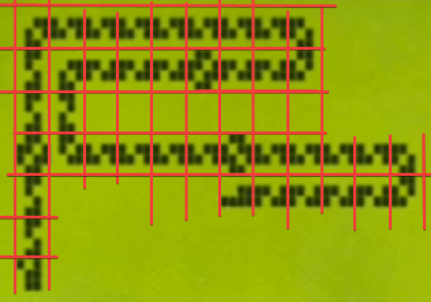
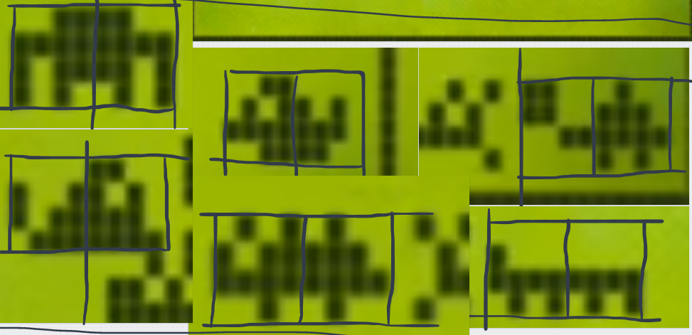
To recreate the pixel art, I took screenshots of the original gameplay and sliced up the image (as seen below) to reveal the pixel layout of each segment type. I then recreated these segment types as separate prefab instances in Unity using square sprites as pixels. I followed the same procedure to create the pixel art for the snake food and each bonus point food type, which I call ‘critters.’ Each grid position in the original game is a 4x4 pixel area, so each prefab was carefully constructed such that each pixel lines up correctly in its 4x4 grid area. Each critter took up two grid spaces, so their prefabs have a left and right side.
Implementing the Pixel Art
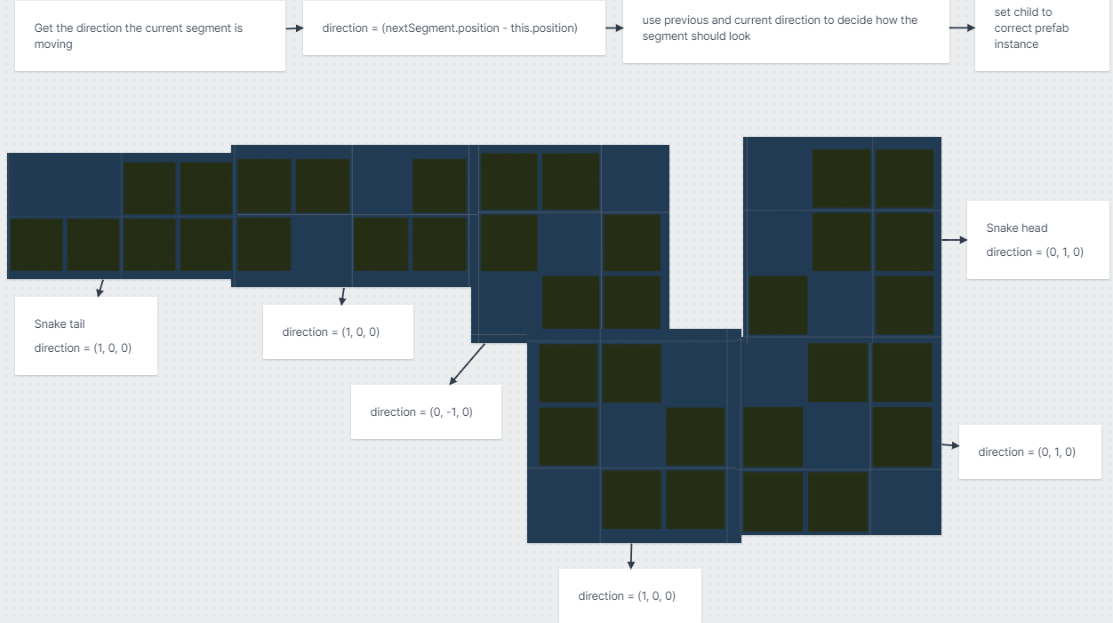
To implement the pixel art using my prefabs, I needed a way to know which prefab to show for each segment each frame. This choice depends on the positions of the segment in front of and behind the segment in question. So all I needed to do was track the direction of each segment – calculated with (nextSegment.position - this.segment.position). After normalizing this direction vector, I gad a reliable way of figuring out which direction any given segment is going. Wiring up the logic was as simple (and unsightly) as writing conditionals to check the current segment’s direction and the previous segment’s direction and swap to the appropriate segment prefab.
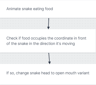
Next up was animating the snake’s head to make it appear as if it is chomping down each bit of food it collects. To do this, I check if the coordinate in front of the snake’s head is occupied by food. If so, I switch the head prefab to its open-mouth variant.
The last step to implementing the original snake graphics was to animate the snake digesting the food, visualized as a bigger segment that starts at the head and passes through the snake to the tail, as seen below.
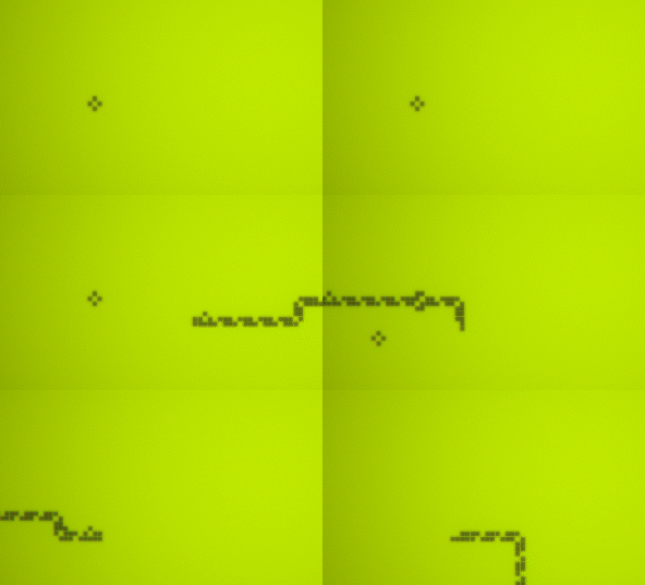
After a few trials and errors, I landed on a working, albeit a bit convoluted, approach. Each time the snake’s head collects food, I add the grid position of the food to a list. Each movement step, each segment checks to see if its own position is in the list. If so, it changes its prefab to the digesting variant. Once a given list position passes over the tail, I remove it from the list.
Retro Aesthetic
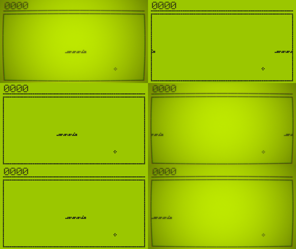
I utilized Unity’s post-processing stack to align the game more closely to the original aesthetic. Effects I used across the board include vignette, film grain, chromatic aberration, and bloom. A slight lens distortion effect sells the retro aesthetic even more. It is essential not to go overboard with post-process effects, as they can quickly become too heavy-handed and distract rather than immerse.
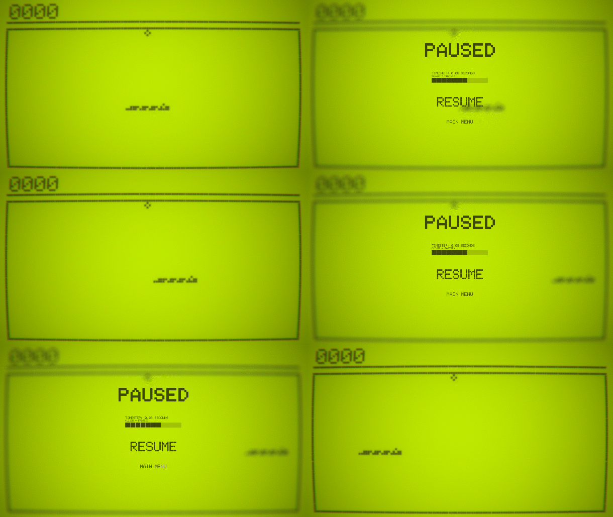
When the player has the game paused, I switch the post-process profile to one including depth of field, which, when adjusted properly, blurs the game behind the pause UI panel. I use the same effect to blur the background video playing on the main menu.
I made the sound effects by downloading a royalty-free retro blip and duplicating it at different pitches in Audacity, a free and open-source audio editing tool.
Results and Remarks
Gameplay
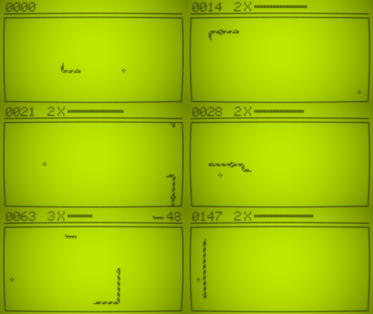 As of my writing this, the following mechanics from the original game made their way into my project:
- Edge wrapping
- Score counter
- Random food spawns
- Chance to spawn high point food (critter)
- Critter despawn timer
You may notice in the gif above that I also added a mechanic that was not present in the original game: a combo system. I implemented this because I felt it added depth to the gameplay experience in a few ways. The combo system enhances the auditory experience due to the current combo level affecting the pitch of the food collection sound effect. The combo system also changes how the player makes decisions regarding movement. In the original game, the player can take as much time as they like to get from one food to the next, which lends itself to a more casual gameplay experience. With the combo system, the player receives a reward for finding the fastest route from one food to the next in the form of a more significant score increase.
The Good, the Bad, and the Ugly
The Good: I am happy with the final state of this project. The aesthetic is interesting, the gameplay feels rewarding, and I think I brought something interesting to the genre with the combo system. Along the way, I learned valuable lessons about the observer pattern and architecting the project in an OO style. I also accomplished my goal of keeping track of tasks using Milanote. I’ll try using GitHub Projects for my next project and compare the two.
The Bad: I went overboard with the observer pattern. I encountered my first real experience with the Golden Hammer problem in this project. I tried to make the observer pattern solve a problem in many cases, even when it wasn’t the best approach. It would have paid off to do a bit more planning to figure out the responsibilities of each of my classes. I have classes performing tasks unrelated to their intended purpose in a few places.
The Ugly: In various classes, I did not do an adequate job refactoring duplicate code, making these classes more verbose than needed. Aside from this, the UI is incredibly fragile. I constructed the game border from many individual square sprites. The UI only functions appropriately in a 16:9 aspect ratio, so I locked the window to 1920x1080. If I were to change this, I would most likely design the game to take place on a Nokia 3310 screen and let that be static so the user can resize the window to any size they wish that fits the Nokia on-screen.
| Status | Released |
| Platforms | Windows |
| Author | littleretroboy |
Purchase
In order to download this game you must purchase it at or above the minimum price of $2.99 USD. You will get access to the following files:
